To provide services at the highest level, we use cookies as described in our cookie policy. By using our website, cookies will be placed on your device. You can change your browser settings at any time. Check our cookie policy.

Authors
- Izabela Łaszczuk
Authors
- Izabela Łaszczuk
Content
Categories
Welcome
to our series “Design Decoded”. We are going to share with you our thoughts on the topic of delivering design mockups (by that I mean the drawings that designers create to illustrate how the application should look, for example, the image below.) to developers. Whether you're a developer seeking better ways to communicate your needs to the design team for more effective collaboration or you find yourself frustrated by the repetitive task of explaining crucial details missing from mockups. Perhaps you're a designer struggling with inconsistent information from various developer teams, leaving you without a single source of truth. Either way, I think you can find this series helpful. This is an extremely important part of our everyday work-life and the purpose of this series is to make everybody's lives easier.
If you think about color palettes you may come to the conclusion that it is the least important thing that developers should care about. They can change it anytime, so what’s the difference if they get a full color palette before they start coding or later, for example when the app is already working? Well… That kind of conclusion makes a lot of developers cry at night.
I can partially agree. Yes, we can change colors on the app anytime, but only if they were made properly. But let’s start from the beginning.

And what does he get when he asks for a color palette?

Most often, something like this…
At first glance, everything seems to be fine. After all, we have a color palette provided. So what's the problem?
If you take a closer look for a moment, you will surely notice a few issues.
First and foremost, there are colors on it that are almost identical, there is no consistent naming, there is a lack of color specifications for different states (active, hover, disabled, etc.), and text colors are not marked.
In such a situation, a developer, in order not to create chaos in the code, should immediately go back to the design team with questions. They shouldn’t start work if there is no appropriate color palette because it carries consequences, which we will discuss shortly with examples.
Proper preparation of color configurations and thorough verification can significantly facilitate the creation process in later stages. It is worth taking the time to carefully perform these steps to avoid wasting time later on.

This is how the default color palette looks like in Tailwind. It illustrates the principle according to which designers should provide colors.
The main shade of a given color is the value 500, for example: slate-500, red-500, etc. Anything lighter takes values below 500, and anything darker takes values above 500.
I will use Tailwind as an example, because it works best for us and we have the most experience with it (click here). If you typically use another framework such as Bootstrap, MaterialUI, Bulma, don't worry, you can easily adopt all the principles we provide to suit your needs.
We realize that creating a color palette is not always necessary because there are projects where we use only 3-4 colors. In such cases, a palette is redundant. If so, it is sufficient to provide developers these colors with appropriate names. Use the same name in Figma (or similar design tool, I will just use it as an example) as well as in the code, leaving no doubts about whether it's the same hex code.
In an ideal world, the designer takes the entire Tailwind color palette, selects the colors they want to use, retains their assigned names, and only changes the hex values to those needed for the specific project.
By using these formats in Figma, the developer knows precisely which color to use in the code. Everything is clear and transparent. Such a solution ensures a single source of truth. This streamlines the project creation process and code implementation, ensuring visual consistency and work efficiency.
This can result in situations such as having both "gray" and "grey" representing different colors or names like "lightVioletOrangePurple" or "twilightSparkle" (sic!), which do not provide clear information about the color, where it should be used, if changing it will have any consequences, etc.
This leads to chaos, duplicates* of hex values with different names, and a multitude of almost identical colors.
Take a look yourself, this is a real life example of what code looks like when nobody cares.

*Duplication is generally undesirable, BUT(!) there are situations in which using the same hex value and giving it a new name is entirely justified and even recommended. For example, if you've added a color named "promotion" to the palette, knowing that it will change later, and there's a place in the application where you need the same color but don't want it to change later (e.g., for a warning message), in that case, you should add a color to the palette with a name "warning" and use the same hex value as for "promotion."
By doing this, you eliminate future issues, such as manually checking the entire application to ensure that you didn't inadvertently change the color in places where it wasn't supposed to change when modifying a campaign.
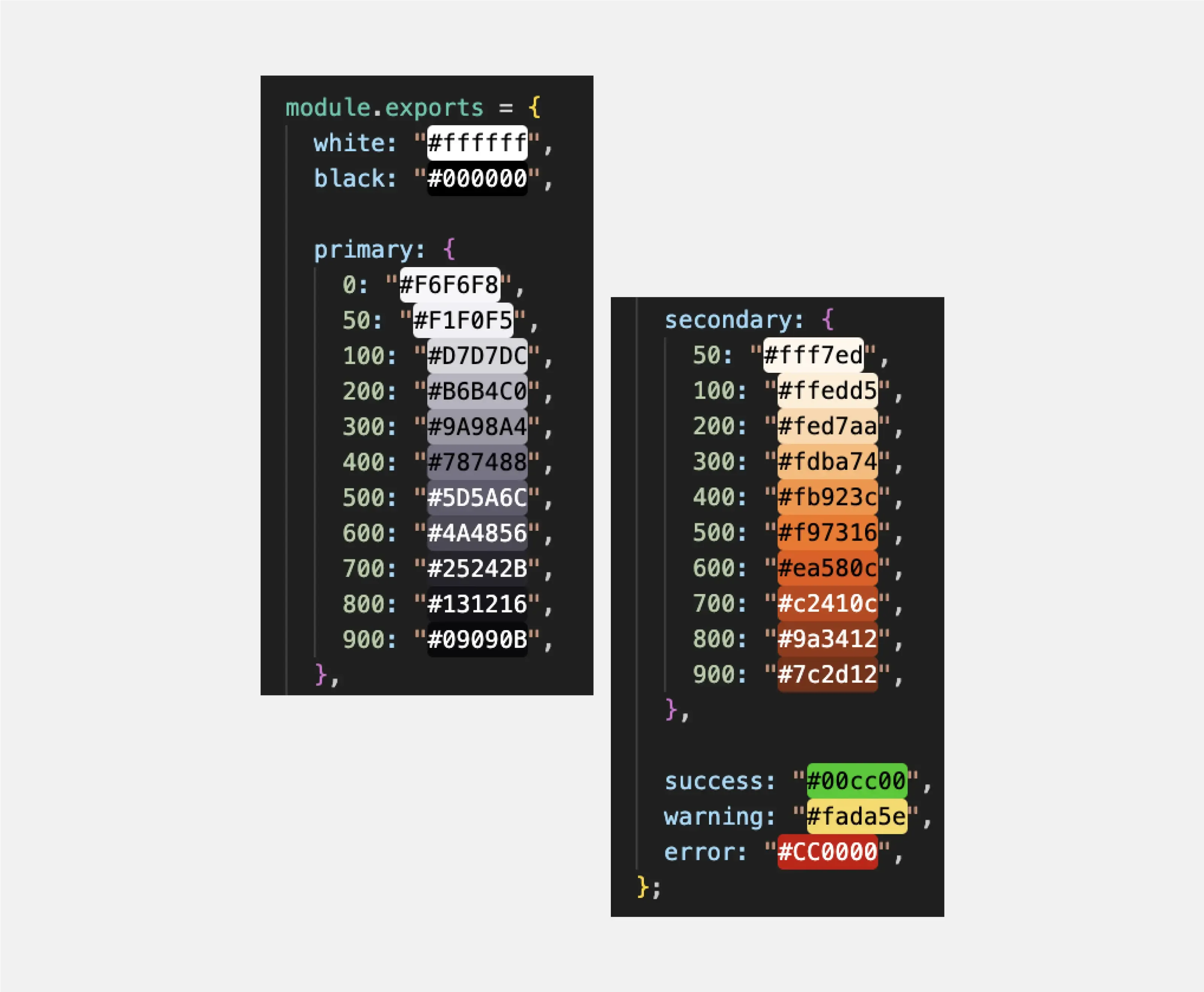
Another example shows what happens when the design has been using a color palette from the beginning of the project. Developers created names following the Tailwind concept. The same names are used in Figma.

Everything is clear and easily editable. Look at the difference in code:

That should be the end of this article, but unfortunately life is not so easy and even creating a color palette this way can cause problems in some cases…
By using these formats in Figma, the developer knows precisely which color to use in the code. Everything is clear and transparent. Such a solution ensures a single source of truth. This streamlines the project creation process and code implementation, ensuring visual consistency and work efficiency.
Ok, but why?
If the design does not use a color palette from the beginning of the project and during its development, new, almost identical colors are added to Figma during its development without being assigned to any variables or organized into families/groups (e.g., gray, blue, etc.). Developers may add them to the project by inventing their own names. Over time, these names may (and most probably will) become less descriptive.This can result in situations such as having both "gray" and "grey" representing different colors or names like "lightVioletOrangePurple" or "twilightSparkle" (sic!), which do not provide clear information about the color, where it should be used, if changing it will have any consequences, etc.
This leads to chaos, duplicates* of hex values with different names, and a multitude of almost identical colors.
Take a look yourself, this is a real life example of what code looks like when nobody cares.
*Duplication is generally undesirable, BUT(!) there are situations in which using the same hex value and giving it a new name is entirely justified and even recommended. For example, if you've added a color named "promotion" to the palette, knowing that it will change later, and there's a place in the application where you need the same color but don't want it to change later (e.g., for a warning message), in that case, you should add a color to the palette with a name "warning" and use the same hex value as for "promotion."
By doing this, you eliminate future issues, such as manually checking the entire application to ensure that you didn't inadvertently change the color in places where it wasn't supposed to change when modifying a campaign.
Another example shows what happens when the design has been using a color palette from the beginning of the project. Developers created names following the Tailwind concept. The same names are used in Figma.
Everything is clear and easily editable. Look at the difference in code:
That should be the end of this article, but unfortunately life is not so easy and even creating a color palette this way can cause problems in some cases…
Let's imagine that the primary color in your project is the shade pink-500, which you use to style many elements. However, the project is long-term, and after some time, the client changes their mind, deciding that the main color should now be blue-500.
That shouldn’t be a problem, you created a color palette and prepared yourself for this, right? Right?

WRONG. There could be hundreds of places where you would need to change such a color. It's not difficult, but it can take a significant amount of time, which you certainly don't want to waste. Additionally, the color pink may be used in non-primary areas, for example, as a decorator, and you might want to preserve it. In such a case, changing the color requires manually navigating through the entire application and checking each place individually.
You shouldn't use such naming conventions in areas susceptible to future changes. For instance, a promotional banner during different campaigns may require other colors.
But don’t worry, there is a better solution for this kind of situation!
For long-term projects or promotional banners, the best solution is to name colors as "primary," "secondary," "promotion," etc. Disclaimer - this doesn’t only apply to long-term projects. To be honest, sometimes clients can change their mind even during a short and small project, so you need to decide which method to choose. Maybe combine both? Primary & secondary for colors that have the biggest risk of changing and gray, yellow etc. for the colors that have a small risk.
This way, there won't be a need to go through the entire project, component by component, changing bg-orange-200 to bg-blue-200. All you need to do is replace the hex codes of the primary color in one place, where it has been declared.
By using abstract names (don’t get too crazy here. Primary-second, secondary-main, secondary-double are not good names), you can easily change the color palette of the project without altering the HTML or CSS code itself. You can update the colors assigned to abstract names to adapt the project to evolving requirements.
If the project dynamically changes colors based on data such as rankings, status, or results, using abstract color names can simplify mapping this data to appropriate styles.
WRONG. There could be hundreds of places where you would need to change such a color. It's not difficult, but it can take a significant amount of time, which you certainly don't want to waste. Additionally, the color pink may be used in non-primary areas, for example, as a decorator, and you might want to preserve it. In such a case, changing the color requires manually navigating through the entire application and checking each place individually.
You shouldn't use such naming conventions in areas susceptible to future changes. For instance, a promotional banner during different campaigns may require other colors.
But don’t worry, there is a better solution for this kind of situation!
For long-term projects or promotional banners, the best solution is to name colors as "primary," "secondary," "promotion," etc. Disclaimer - this doesn’t only apply to long-term projects. To be honest, sometimes clients can change their mind even during a short and small project, so you need to decide which method to choose. Maybe combine both? Primary & secondary for colors that have the biggest risk of changing and gray, yellow etc. for the colors that have a small risk.
This way, there won't be a need to go through the entire project, component by component, changing bg-orange-200 to bg-blue-200. All you need to do is replace the hex codes of the primary color in one place, where it has been declared.
By using abstract names (don’t get too crazy here. Primary-second, secondary-main, secondary-double are not good names), you can easily change the color palette of the project without altering the HTML or CSS code itself. You can update the colors assigned to abstract names to adapt the project to evolving requirements.
In what other cases should we apply this principle?
When creating a white label solution, a project meant to serve multiple brands. Each new client may want their own color scheme. If abstract names are used, it becomes easier to customize colors for different visual identities without the need to change code in multiple places.If the project dynamically changes colors based on data such as rankings, status, or results, using abstract color names can simplify mapping this data to appropriate styles.
Gradients should be handled similarly to colors. Designers should assign gradient values to a variable, creating a gradient palette that developers manage in a manner analogous to colors.This saves time that would otherwise be spent rewriting these values each time, instead of using variables. Providing variables positively impacts the order and readability of the code.
Why?

Here is how the code looks when the design doesn't use a gradient palette.
How did it happen?
The design didn't provide gradients at the beginning of the project. It might not have been as much of a problem if, when providing them later, the designer assigned them to variables. Developers would then immediately create a config file and give them appropriate names.
Unfortunately, each gradient in the project was provided in this way:

Developers started using gradients as independent elements. The result was the emergence of duplicates and nearly identical gradients, making them difficult to maintain. The code became chaotic, disorganized, and less readable, negatively impacting the entire design process.
It's essential to remember the consequences of inconsistency in the naming and organization of gradients. Maintaining orderly code and effectively managing design resources can significantly expedite the process of creating and maintaining a project in the future.
What should it look like?

From the beginning, the design team ensures that gradients intended for use in the project are assigned to variables, creating a gradient palette.

Developers add them as organized variables to the project. Everyone uses the same names (both in the code and Figma).This makes the code clear and very easy to edit.

Why?
Here is how the code looks when the design doesn't use a gradient palette.
How did it happen?
The design didn't provide gradients at the beginning of the project. It might not have been as much of a problem if, when providing them later, the designer assigned them to variables. Developers would then immediately create a config file and give them appropriate names.
Unfortunately, each gradient in the project was provided in this way:
Developers started using gradients as independent elements. The result was the emergence of duplicates and nearly identical gradients, making them difficult to maintain. The code became chaotic, disorganized, and less readable, negatively impacting the entire design process.
It's essential to remember the consequences of inconsistency in the naming and organization of gradients. Maintaining orderly code and effectively managing design resources can significantly expedite the process of creating and maintaining a project in the future.
What should it look like?
From the beginning, the design team ensures that gradients intended for use in the project are assigned to variables, creating a gradient palette.
Developers add them as organized variables to the project. Everyone uses the same names (both in the code and Figma).This makes the code clear and very easy to edit.
Setting text colors is a crucial step in the design process. It often happens that the text color is created by adding opacity to white or black (which is a bad practice, you can read more about it here). Typically, we need two main text colors that are suitable for light and dark backgrounds to ensure proper readability and aesthetics. These colors should come from a previously prepared color palette.

*same applies to error, warning, success, active, hover, visited, targeted, disabled
Similar to font colors, it often happens that mockups do not account for the color that outlines should adopt during the focus state (a state in which a particular element is active or selected) of elements when navigating through them using the keyboard. This primarily concerns interactive elements such as buttons, links, and all form elements (inputs, selects, etc.). To adhere to good design practices, it is advisable to consider using an existing color in the context of the outline. Another crucial aspect is ensuring an appropriate contrast for the outline against the background.
Pay attention to various types of buttons. Should the "button error" and "button primary" have the same outline color during focus?
The best way to present it? Take a look at this example:
The importance of providing developers with well-structured and comprehensive color palettes cannot be overstated. It goes beyond mere aesthetics; it directly impacts the efficiency, consistency, and maintainability of a project. The process of creating a color palette involves careful consideration and collaboration between designers and developers to ensure a seamless transition from design to code.
Ultimately, the collaborative effort between designers and developers in establishing and maintaining a thoughtfully crafted color palette is pivotal for a project's success. It not only enhances the visual coherence of the application but also contributes significantly to the overall efficiency and ease of future development and maintenance. As the design and development worlds continue to evolve, embracing these principles ensures a smoother, more harmonious workflow for both parties involved.
Happy coding/ happy designing!